The intriguing world of floral design places a premium on color definition. Floral arrangements are more than just groups of flowers; they become living works of art that convey ideas, emotions, and tales through the use of color. Understanding the effect, harmony, and communication power of colors is more important than simply naming hues when it comes to floral design.
Understanding Color Basics
It is crucial to understand color theory’s foundations before delving into the definition of color floral design. In general, there are three levels of color classification: primary, secondary, and tertiary. When it comes to floral design using primary colors, yellow, blue, and red are key. All other colors are derived from these fundamental ones.
Primary Colors in Floral Design
All other colors are derived from primary colors, which are also the foundation of the color wheel. The three main hues used in floral design are yellow, blue, and red. Now we’ll examine each of them in greater detail:
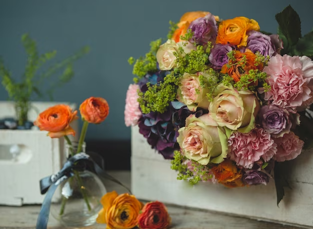
- Red: Bold and passionate, red is a hue that speaks volumes. Frequently, it represents passion, ardor, and fervor. Because of their power to stir up intense feelings, red flowers are a popular choice for romantic events like weddings and anniversaries when arranging bouquets;
- Blue: A state of peacefulness, peace, and tranquility is symbolized by the color blue. It has the ability to make floral arrangements feel soothing and tranquil. For a calming and comforting effect, blue flowers are a common choice;
- Yellow: The cheerful hue of yellow is often associated with positive emotions like joy, friendship, and happiness. Celebrations and happy gatherings often use yellow flowers because of the warmth and enthusiasm they convey.
Secondary Colors
A color’s secondary hues develop from its basic hues. The result of an equal mixture of two primary colors is three secondary hues:
- Green: To make green, you mix blue and yellow. Green represents balance, new beginnings, and expansion. Because of its association with nature, this color is commonly chosen to express sentiments of harmony and new beginnings;
- Orange: An energizing and lively hue, orange is the result of mixing red and yellow. The color orange is often thought of as a symbol of energy and friendliness. It may inject some life and energy into flower arrangements;
- Purple: A hue typically linked with mystery, opulence, and majesty, purple is the result of combining red and blue. When used in floral arrangements, purple flowers can exude an impression of mystery and refinement.
Tertiary Colors
The combination of primary and secondary colors results in tertiary hues. Colors like blue-green and red-orange are examples of tertiary hues that are created when two neighboring secondary colors are mixed with a primary color. You may add depth and nuance to your flower arrangements by using these hues.
After we went over the fundamentals of the color wheel, we can go on to discussing how to use the emotional language of colors in flower design to create effective arrangements.
The Emotional Language of Colors in Floral Design
In floral design, colors convey meaning more effectively than any other medium. Without using words, they are able to communicate feelings and ideas. In flower design, colors are used to evoke certain emotions. Here is a table that summarizes these associations:
| Color | Emotion/Message |
|---|---|
| Red | Love, Passion |
| Yellow | Happiness, Friendship |
| Blue | Calmness, Serenity |
| Green | Growth, Harmony |
| Orange | Enthusiasm, Energy |
| Purple | Royalty, Mystery |
Harmonizing Colors in Floral Arrangements
Harmony in color floral design definition is about how different colors are combined to create visually pleasing arrangements. There are several approaches to achieving color harmony:
Monochromatic Harmony
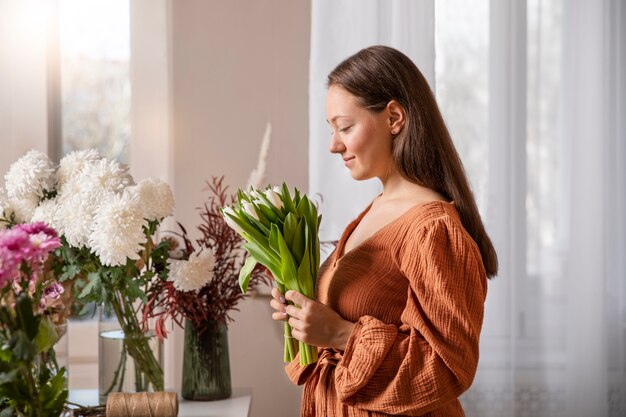
Monochromatic color harmony achieves a remarkable sense of unity and sophistication by utilizing varying shades and tones of a single color in a floral arrangement. This approach is a go-to choice for those seeking to infuse an air of elegance into their designs. To master monochromatic harmony:
- Select a Dominant Color: Begin by choosing one primary color to serve as the focal point of your arrangement. This color sets the tone for the entire composition;
- Vary Shades and Tones: To add depth and dimension, incorporate lighter and darker shades of the chosen color. This variation creates visual interest and prevents monotony;
- Add Neutral Elements: Balancing the monochromatic palette is essential. Introduce neutral flowers or greenery to the arrangement to provide contrast and maintain a sense of equilibrium.
Analogous Harmony
Analogous color harmony draws inspiration from nature by combining colors that sit adjacent to each other on the color wheel. This approach mimics the pleasing and harmonious color combinations found in the natural world. To embrace analogous harmony:
- Choose a Dominant Color: As a starting point, select one main color that will anchor your floral arrangement. This color will play a pivotal role in defining the overall mood;
- Include Neighboring Colors: To achieve cohesiveness and balance, incorporate one or two colors neighboring the dominant hue on the color wheel. These adjacent colors complement each other effortlessly;
- Consider Variations: To infuse depth and intrigue, make use of different shades and tones within the chosen analogous colors. This subtle variation adds complexity to the arrangement while maintaining its harmonious appeal.
Complementary Harmony
Complementary color harmony relies on the bold pairing of colors situated directly opposite each other on the color wheel. This technique creates a captivating and dynamic contrast, infusing vibrancy and energy into floral compositions. To harness the power of complementary harmony:
- Choose Two Opposite Colors: Start by selecting two colors that stand in stark contrast to each other on the color wheel. This striking opposition is the essence of complementary harmony;
- Use One as Dominant: Decide which of the two colors will take center stage as the dominant force, while the other serves as an accent. This balance ensures that neither color overwhelms the composition;
- Balance the Proportions: Change the ratio of the main color to the accent color to keep the balance. A visually stunning and harmonious flower arrangement is the outcome of thoughtful analysis of the placement of these clashing hues.
Color and Texture Interplay
Color and texture are two fundamental elements that influence the aesthetics of floral arrangements. Let’s dive deeper into how they interact and their role in floral design:
The Impact of Color
Color is a fundamental element in floral design, and it plays a pivotal role in capturing our attention, setting the mood, evoking emotions, and conveying a message. To fully understand the impact of color in floral arrangements, it’s crucial to consider the following key points:
- Color Selection: The choice of colors should be guided by the occasion or theme of the arrangement. Different colors have distinct symbolic meanings and can elicit specific emotions. For example:
| Color | Symbolic Meaning | Suitable Occasions |
|---|---|---|
| Red | Associated with love and passion | Romantic occasions like weddings and anniversaries |
| Blue | Signifies calmness and serenity | Events focused on relaxation or reflection |
- Color Combinations: Understanding color harmonies is essential in creating visually pleasing floral arrangements. Various color combinations can be employed, including:
| Color Harmony | Description | Visual Effect |
|---|---|---|
| Monochromatic | Involves different shades and tones of a single color. Creates a sense of harmony and simplicity. | Unified and tranquil appearance |
| Analogous | Utilizes colors adjacent to each other on the color wheel (e.g., shades of blue and green). Offers a pleasing and cohesive look. | Smooth and harmonious blending |
| Complementary | Combines colors that are opposites on the color wheel (e.g., red and green). Creates striking contrasts. | Vibrant and visually impactful |
The Role of Texture
Texture, in floral design, pertains to the tactile quality of flowers and foliage. It adds depth, interest, and dimension to your arrangement. Understanding how texture impacts your floral design is crucial for creating visually appealing compositions. Here’s a detailed exploration of texture’s role:
- Enhancing Color: Texture has the remarkable ability to enhance the perception of color. For instance:
| Texture Example | Impact on Color and Visual Effect |
|---|---|
| Velvety Red Rose | Appears more intense compared to a smoother-textured red tulip. Petal texture influences light reflection and absorption, affecting color vibrancy. |
| Foliage with Fine, Fuzzy Textures | Softens the overall appearance of an arrangement. Creates a gentle contrast when paired with bold, vibrant flowers. |
- Contrast and Balance: Texture plays a significant role in creating contrast and balance within a floral arrangement. Mixing various textures can add intrigue and make colors stand out:
| Texture Combination | Visual Effect and Impact on Arrangement |
|---|---|
| Smooth, Glossy Flowers with Rough or Matte Foliage | Creates a visually striking contrast. Enhances the overall visual appeal of the arrangement. |
| Incorporating Textures like Thistles or Succulents | Adds unique focal points and depth to the arrangement. Makes the arran |
The Art of Combining Color and Texture
Now that we understand the individual roles of color and texture, let’s explore how they can be skillfully combined to elevate your floral designs:
Creating Harmony
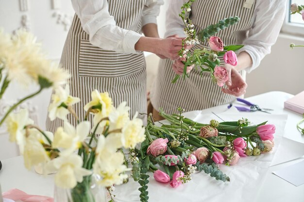
Achieving harmony between color and texture is a fundamental aspect of floral design. It requires careful consideration of the occasion, balance, and experimentation.
- Consider the Occasion: The occasion or purpose of the floral arrangement should be the starting point for your color and texture choices. Different events call for different moods and aesthetics. For instance, a romantic wedding bouquet may benefit from soft, textured blooms in pastel hues, evoking a sense of delicacy and elegance. On the other hand, a vibrant and textured arrangement may be more suitable for a festive celebration;
- Balance and Contrast: Strive for a harmonious balance between smooth and textured elements within your floral design. A well-balanced arrangement offers visual interest and aesthetic appeal. If your arrangement leans towards a predominantly smooth-textured look, consider adding a few textured focal flowers or foliage to create contrast and excitement. Conversely, if you have an abundance of textured elements, introducing smoother components can create a more balanced composition;
- Experiment: Floral design is an art, and like any art form, experimentation is key to growth and mastery. Don’t hesitate to try different combinations of color and texture. Keep a journal or take notes on what works best for specific situations. Building your repertoire of successful color-texture pairings is a continuous learning process.
Texture and Color Pairings
To help you get started on your journey to masterful floral design, here are some popular texture-color pairings that you can incorporate into your arrangements:
| Texture Type | Complementary Colors |
|---|---|
| Smooth | Creamy white with greenery |
| Velvety | Deep reds and purples |
| Matte | Soft pastels with baby’s breath |
| Glossy | Bright yellows and oranges |
| Ruffled | Pinks and coral hues |
| Fuzzy | Earthy greens with brown accents |
These pairings can serve as a valuable reference when selecting flowers and foliage for your arrangements. However, keep in mind that these are not rigid rules but rather guidelines to spark your creativity. Feel free to adapt and combine colors and textures according to your artistic vision and the specific context of your floral design project.
Conclusion
The color definition in floral design is a rich and complex subject, blending art and science. It’s the color in floral designs that make them truly captivating, conveying emotions, and bringing beauty to our lives. Whether it’s understanding the primary colors floral design definition or exploring the emotional weight of different hues, color remains an essential, vibrant thread in the tapestry of floral design.
FAQ
Color is crucial in floral design as it sets the mood and theme of the arrangement. It can transform the message and feel of a floral piece.
Absolutely! Colors can carry different meanings in different cultures. For instance, white is often associated with weddings in Western cultures but can symbolize mourning in some Eastern cultures.
Experimenting is key! Also, studying the color wheel and understanding color theory basics can be incredibly helpful.